Electronic information and job notice board for the StAlkErS Filmsim game
For several years, the StAlkErS event relied on a large whiteboard and a dry marker to communicate jobs, resource prices, and rewards. It worked in the loosest sense. Jobs were written up by hand, crossed off when completed, rewritten when priorities changed, and periodically ignored when the person responsible was pulled away to deal with something else.
The system had several weaknesses. Updates were slow and manual. Handwriting was not always legible. Players often missed changes unless an announcement was made. Most importantly, the whiteboard felt completely out of place. In a world inspired by Fallout and Metro 2033, a modern office whiteboard was a visual and thematic mismatch.
As the StAlkErS universe expanded, with more tech driven props and more layered mechanics, the whiteboard increasingly became the weakest link. It delivered information, but it did not support immersion, pacing, or flow.
The decision was not to invent a new mechanic, but to rebuild an existing one properly. Jobs already existed. Resource trading already existed. Exchange rates already existed. What was missing was a system that could present all of that information clearly, reliably, and in a way that felt native to the world.
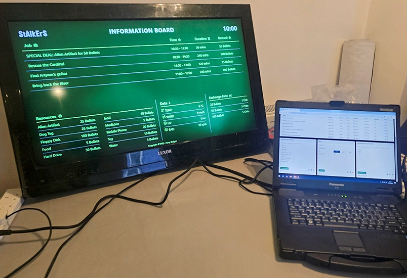
The idea was simple. A large screen mounted on the wall of the trader’s safe zone, acting as a permanent in world information board. Something players could gather around, read from a distance, and use to plan their next move without needing organiser intervention.
Crucially, this was designed as a standalone system. No internet. No network. No dependency on venue infrastructure. The event runs in remote locations with generator power and limited connectivity, so the board had to work entirely offline and continue running all weekend without intervention.
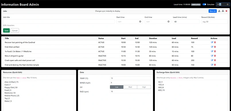
The information board is driven by a hidden admin interface accessed from a laptop behind the trader’s counter. Players never see it. Only the in world display is visible.
From the admin view, jobs can be created with a title, reward, start time, end time, and lead time. Lead time became a key mechanic. Short lead times discourage players from hoarding resources in anticipation of favourable trades. Longer lead times allow teams to prepare for larger objectives that require coordination and planning.
Jobs can be queued in advance for the entire event. Only a limited number are displayed at once, enforcing clarity and preventing the board from becoming cluttered. As time progresses, jobs naturally move between inactive, active, and expired states.
Resources and their values are editable in real time. If the shop becomes flooded with water, its value can be reduced instantly. If a rare item becomes strategically important, its price can rise without explanation or warning. The in game economy becomes something that can be steered rather than fixed.
Environmental data such as temperature, wind, UV, and radiation is deliberately fictional. Its purpose is flavour, not simulation. It reinforces atmosphere and world state without pretending to be real telemetry.
Because the system is entirely time driven, development and testing introduced an obvious problem. Waiting until specific times of day to see how the board behaved was impractical.
The solution was a simulated time mode. With a single toggle, the admin can override real time and specify a fictional time of day. This allows the board to be previewed exactly as it will appear at any point during the event. It also allows all jobs, resources, and exchange rates to be validated in advance.
This feature proved essential for confidence. Entire weekends worth of content could be reviewed, adjusted, and stress tested before the first player arrived.
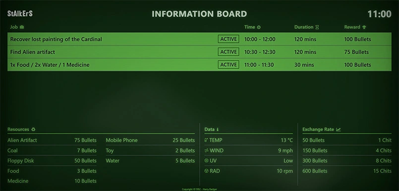
The player view was intentionally designed to feel familiar. Inspiration came from train station and airport departure boards. Information is laid out clearly, prioritised, and readable from across a room.
Active jobs are visually highlighted. Upcoming jobs are visible with their start times and durations. Rewards are clear and unambiguous. Players do not need to ask questions to understand what is available.
Visually, the board continues the CRT inspired Fallout aesthetic used across other StAlkErS tech props. Scan lines, flicker, glow, and a dark green on black palette turn a modern flat screen into something that feels industrial, old, and in world. This continuity matters. The board looks like it belongs.
Rather than players checking a notice, they gather around it. Teams discuss options. Plans are formed in front of the screen. The board becomes a physical meeting point, not just an information source.
During the event, the Information Board quickly proved its value. Players naturally gravitated towards it without prompting. Jobs were noticed immediately. No tannoy announcements were needed. No one had to remind teams to check the board.
Comet, the trader character, controlled the system. Posting jobs became part of the performance. Prices and rewards could be adjusted in response to player behaviour, story progression, or pacing needs. The board supported improvisation without chaos.
From an organiser perspective, workload dropped significantly. From a player perspective, clarity and immersion increased. The system quietly did its job in the background.
The StAlkErS Information Board is considered complete. It does exactly what it was designed to do, and it does it reliably. There are no planned upgrades or expansions in the near future.
Like several other StAlkErS projects, this was not about adding complexity. It was about taking an existing mechanic, removing friction, and presenting it in a way that respects the world, the players, and the organisers.
Replacing a whiteboard might sound trivial. In practice, it changed how the game flowed.
An interactive retro computer terminal with user interface inspired by the Fallout games.
Read more